
Decoding Liquidity Heatmaps: A Beginner's Guide to Uncovering Market Intent

Reading a liquidity heatmap is a crucial skill for any trader looking to gain an edge in the markets, and it all starts with understanding what the colours mean. A liquidity heatmap is a visual representation of market liquidity, with colours representing the intensity of buy and sell orders at different price levels. Typically, red and green colours are used to denote buy and sell orders respectively, while yellow or orange colours may indicate areas of high liquidity or neutral sentiment.
What do the colours mean on a liquidity heatmap?
When looking at a liquidity heatmap, the colours can tell you a lot about market sentiment and potential trading opportunities. For example, a large area of red may indicate a high level of buying interest, while a large area of green may indicate a high level of selling interest. By analysing these colour patterns, traders can identify potential support and resistance levels, as well as areas where the market may be poised to make a significant move.
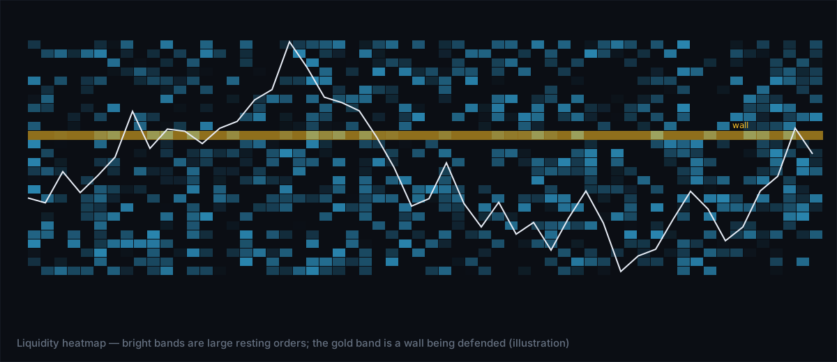
Identifying walls on a liquidity heatmap
A 'wall' on a liquidity heatmap refers to a large concentration of buy or sell orders at a specific price level. These walls can be an important indicator of market intent, as they may represent a level of support or resistance that the market is unlikely to break through. By identifying walls on a liquidity heatmap, traders can adjust their trading strategies to take advantage of these areas of high liquidity and potential trading opportunities.
How to spot spoofing on a liquidity heatmap
Spoofing refers to the practice of placing fake orders in an attempt to manipulate the market. On a liquidity heatmap, spoofing may appear as a large, sudden spike in buy or sell orders that is not supported by other market activity. By monitoring the liquidity heatmap for these suspicious patterns, traders can avoid falling victim to spoofing and make more informed trading decisions.
Understanding absorption on a liquidity heatmap
Absorption occurs when a large amount of buy or sell orders is 'absorbed' by the market, resulting in a minimal impact on price. On a liquidity heatmap, absorption may appear as a gradual increase in the intensity of buy or sell orders, followed by a sudden decrease as the orders are absorbed. By identifying areas of absorption, traders can gain insights into market sentiment and potential trading opportunities.
The bottom line
Reading a liquidity heatmap is a powerful tool for any trader looking to gain an edge in the markets. By understanding what the colours mean, identifying walls, spotting spoofing, and recognizing absorption, traders can uncover hidden market dynamics and make more informed trading decisions. With practice and experience, traders can develop the skills needed to decode liquidity heatmaps and take their trading to the next level.